

How to predict future values based on past records? Beginner Post.
How to predict future values based on past records? Beginner Post.
Understanding the numpy.polynomial.polyfit method.

Prologue:
Let us assume you are planning to invest money into shares. So, what do you do? You look up past records of the shares, how their prices have been rising and falling overtime and try to detect patterns. Based on those pasts records you will try and detect patterns. Let us say the price is increasing by ₹100 per month. So, we predict that the price will be current price + 600 after 6 months.
Another possible scenario: You try to predict the rainfall in January in Varanasi. Again you look up past records, fortnightly records maybe, you will find some rising and falling patterns.
Our first pattern was linear, the second would be a higher degree curve.
How do you predict future values based on past records?
The answer is numpy.polynomial.polyfit.
We will begin exploring the polyomial module beginning with this post.
🙂
What you will learn in this post?
Input a data set containing input data and output into the program.
Attempt to fit a polynomial to best represent the given data.
Finding the power of the equation that best fits the data.
Find the accuracy of the fit, called the Coefficient of Regression.
Plot the best fit polynomial.
Generate predictions using the generated polynomial.
Continuing from a previous post at.

The documentation for numpy.polynomial is at.
In particular we are using the polyfit method whose documentation is at.
The polyfit method fits a given X-Y data and its signature is poly.polyfit(x, y, deg=r). The deg is degree. If deg=0 then it attempts to fit a constant, if 1 then a straight line, for 2 a quadratic curve and so on. This function returns a ndarraay of power coeffcients.
The polyval function is used for evaluating the polynomial for a certain X array.
Its documentation is at.
We are using the pyplot method for drawing plots. Its documentation is at.
Lastly, we use the r2_score function of sklearn and it returns (coefficient of determination) regression score function.
We begin the code by importing the required modules.
import numpy
from numpy.polynomial import polynomial as poly
import matplotlib.pyplot as plt
from sklearn.metrics import r2_score
import random
import warnings
warnings.simplefilter('ignore', numpy.polynomial.polyutils.RankWarning)
I have forced ignoring the RankWarning. We will tackle this is a future post.
The inputs
x = [1,2,3,4,5,6,7,8,9,10]# Input X from 1 to 10
listy=[[2,2,2,2,2,2,2,2,2,2],[1,2,3,4,5,6,7,8,9,10],[1,4,9,16,25,36,49,64,81,100],[1,8,27,64,125,216,343,512,729,1000],[1,16,81,256,625,1296,2401,4096,6561,10000],[random.randint(-10, 10),random.randint(-10, 10),random.randint(-10, 10),random.randint(-10, 10),random.randint(-10, 10),random.randint(-10, 10),random.randint(-10, 10),random.randint(-10, 10),random.randint(-10, 10),random.randint(-10, 10)],[1,-1,1,-1,1,-1,1,-1,1,-1]]
titles=["Constant","Linear","Quadratic","Cubic x^3","x^4","Random","ALternate"]
colors=["blue","red","yellow","green","black","brown"]
The data in listy provides Y data of increasing degrees. The first is constant = degree 0, next is 1 ,, upto x^4 , the 5th is random values between -10 and 10. 6 is alternately 1 and -1.
A future module gives you the option to select one Y value set from 0 to 6.
The data will give perfect fits everytime except for the last two where we have random values and an alternate +ve,-ve series. We will explore imperfect series in the next post.
'''
Input Y.
0 is constant
1 is linear
2 is quadratic
3 is cubic = x^3
4 is x^4
5 is random between -10 and 10
6 is alternately +1 and -1
'''
A function to plot and display graphs.
def plotGraph(x,y,scattercolor,linecolor,label,title):
  plt.scatter(x,y,color=scattercolor)
  plt.plot(x,y,linecolor,label=label)
  plt.ylabel('Y')
  plt.xlabel('X')
  plt.title(title)
  plt.legend()
  plt.show()
Next, we have the bestfitModel function that takes as input a X-Y pair and returns a best fit model alongwith its degree and regression score.
def bestfitModel(x,y):
  bestcoeff=-1
  bestmodel=None
  bestpower=0
  degrees=[0,1,2,3,4,5]
  coefficients=[]
  plt.scatter(x,y,color="orange")
  plt.plot(x, y,'orange',label="Original Data")
  for r in range(0,6):
    model = poly.polyfit(x, y, deg=r)# Generate the model
    coeff=r2_score(y, poly.polyval(x,model))
    coefficients.append(coeff)


    plt.plot(x, poly.polyval(x,model),colors[r],label="Degree " + str(r))


    if coeff>bestcoeff:
      bestcoeff=coeff
      bestmodel=model
      bestpower=r
  plt.ylabel('Y')
  plt.xlabel('X')
  plt.legend()
  plt.title("0-5 degrees " + titles[n])
  plt.show()
  plotGraph(degrees,coefficients,"blue","-r","Coefficient","Coefficients v Degrees")
  print("The degrees \n",degrees,"\n coefficients of correlation",coefficients)
  return bestcoeff,bestmodel,bestpower
The final code block where we select a Y option and get the output.
'''
Input Y.
0 is constant
1 is linear
2 is quadratic
3 is cubic = x^3
4 is x^4
5 is random between -10 and 10
6 is alternately +1 and -1
'''
n=int(input("Pick a number between 0 and 6\nnumber= "))
y=listy[n]# Change Here 0,1,2,3,4
plotx=[-5,-4,-3,-2,-1,0,1,2,3,4,5,6,7,8,9,10,11,12,13,14,15]
The final code module and the most important code.
print("\nProcessed Output\n")
coeff,model,power=bestfitModel(x,y)# Return the coefficient of correlation, model as numpy array of coefficients with the powers in increasing power order, and power = highest power.

print("Coeff of consistency ",coeff,", Max Power",power,"\n Calculated Model ",model)
equation=str(numpy.poly1d(numpy.flip(model)))# Get the model output formatted as a equation. Model is an nparray, poly1d requires the array of coefficients in reverse order. Hence th flip.
print("The equation is Y=\n ",equation," for ",titles[n])
ploty=poly.polyval(plotx,model)

plotGraph(x,y,'yellow',"b-","Original","Original Data " + titles[n])
plotGraph(plotx,ploty,'green',"r-","Predicted",'Predicted Data ' + titles[n])
plt.plot(plotx, ploty,"r-",label="Predicted")
plt.scatter(x,y,color="yellow")
plt.plot(x,y,"b-",label="Original")
plt.ylabel('Y')
plt.xlabel('X')
plt.legend()
plt.title("Original - Predicted " + titles[n])
plt.show()
print("\nTabular outputs\n\n")
print("Original X",plotx,", Original Y",y)
print("Input X",plotx,", Output Y",ploty)
xvalue=[-11,7,11]
predict=poly.polyval(xvalue,model)
print("X for input ",xvalue,"Predicted",predict)
To run the program you need to run the last two code blocks on Colab.
First of all I will run the program with a quadratic series that is Y=X cubed. Here is the output.

The result of attempts at fighting different degree curves.

Degree 0 that is constant. The coefficient of correlation is 0.0.

Degree 1, that means a linear curve = straight line. The coeffcient of correlation is 0.8619101559469315. Fairly good fit.
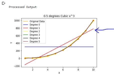
Degree 2 curve attempted. Its the yellow line. Coefficient of correlation is 0.9970951974551944. Almost perfect.

Degree 3 and beyond are perfect fits. Coefficients are 1.

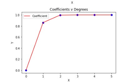
Graph of coefficients of correlation v degrees of curves attempted.
Processed output based on the given X-Y data.
X=1,2,3,4,5,6,7,8,9,10
Y=1,8,27,64,125,216,343,512,729,1000

The equation of the fitted curve

.Y=1*X^3 + 0 because e^-14, -15 and -13 are essentialy 0.
The original curve and predicted curve. Y= X^3.

Here is the tabulated data

Look up the predictions. I have chosen 7 within the tabulated range and -11 and 11 outside the range. The predictions are perfect because the chosen inputs were perfect.
-11 we get -1331
7 343
11 1331
Here is a short Youtube video which you can watch if you have problems running the program in Colab.
The program is on Colab at this link.
We will explore further next week and add some randomness.
Knowledgeable article 🙏